Guides
Ideogram 4 Prompts: Posters, Logos, Typography, and Layouts
Six Ideogram 4 prompt examples for posters, logos, packaging, merchandise, and social graphics, plus a complete JSON layout prompt.
Good Ideogram 4 prompts specify the exact words, their position, and the design around them. Start with a short natural-language brief for exploration. When placement matters, use the model's documented JSON format to separate text, objects, and layout coordinates.
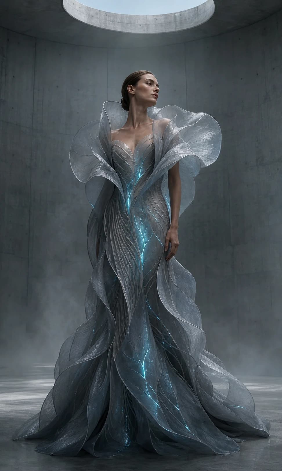
This guide includes six original briefs for posters, logos, packaging, merchandise, social graphics, and editorial imagery, plus a complete JSON example. They are prompts to try, not a claim that we tested these outputs in Ideogram. The header is original editorial art generated separately. Research checked September 10, 2026.
What changed in Ideogram 4.0?
Ideogram released 4.0 on June 3, 2026, with downloadable weights under a commercial license and hosted API access. Its announcement highlights multilingual text, bounding-box layout control, and 2K photographic output. These are the maker's release claims, not a comparative benchmark from this article.
The distinction around layers matters. At launch, transparent cutouts came through the Background Remover. Editable text and movable image layers were described as a follow-up release. Do not assume that a flat generated poster contains editable type simply because the announcement discusses a layered design roadmap.
For a designer, the useful question is specific: can the tool produce the right words in the right region while leaving enough room for the subject? Use that deliverable as the test, rather than asking for an impressive image and deciding afterward where the copy should go.
The prompt structure to use first
Write the deliverable and exact copy first, followed by composition, visual style, and exclusions. Ideogram's typography documentation recommends quoted text, explicit placement, and shorter text blocks.
Create [a flat poster / a product photograph / a square graphic].
Exact visible text: "[headline]" and "[supporting copy]".
Place [headline] in [region], with [size and lettering style].
Place [subject] in [region]. Leave [region] clear.
Use [medium], [palette], and [lighting or texture].
Include only the specified text. [Other concrete constraints].
“Beautiful typography” leaves several decisions unresolved. “A large condensed uppercase headline in the upper third, with a short centered subtitle beneath it” gives you something to evaluate. Likewise, specify a flat finished graphic when you need artwork. A photograph of a framed poster may look attractive but adds perspective and surroundings you did not ask for.
Keep the written content in a separate checklist. A four-letter brand name, a date, and a size label deserve three independent checks. Looking at the whole composition is not a substitute for reading every character.
Six Ideogram prompt examples to adapt
Choose the example closest to your deliverable, then change its content before changing its style. All business names below are fictional creative briefs. The inspection notes describe what to check in your result, not observed performance.
1. An exhibition poster with clear hierarchy
A two-level poster is a useful first test because the headline, supporting line, and central illustration have distinct jobs.
Create a flat portrait graphic poster. Exact text: "FORM & FIRE" in large cobalt-blue uppercase sans-serif lettering across the upper quarter; "CERAMICS EXHIBITION" in small matching capitals near the bottom. One simple terracotta circle occupies the center. Warm ivory paper with subtle print grain. Generous margins and a clear gap around every text line. Restrained geometric editorial design. No wall, frame, extra words, logos, or watermark.Inspect: the ampersand, headline spacing, and whether the circle crowds the lettering. If the layout feels cramped, remove decorative detail before making the type smaller. For a series, keep the layout and change only the title and accent color.
2. A wordmark exploration
Ask for a simple monochrome wordmark when you want to judge letter shapes without packaging, gradients, or a mockup hiding the design.
Create a flat black-on-white wordmark concept for the fictional name "NORI". Render exactly those four uppercase letters, once. Rounded geometric sans-serif letterforms with generous counters, even visual spacing, and a calm contemporary feel. Center the wordmark with wide white margins. No icon, tagline, shadows, gradients, texture, or stationery mockup.Inspect: whether each letter reads immediately at small size. Treat the output as a concept for refinement. If you need editable vector paths or a specific licensed typeface, finish that work in your design software. A raster preview does not establish those deliverables.
3. Product packaging with three text zones
A straight-on package view makes it easier to inspect the label than a dramatic angle does. Keep the fictional label short.
A straight-on studio photograph of one cream paper coffee pouch on a pale stone surface. Exact label text in three separate centered lines: "DAYBREAK", "FILTER COFFEE", "250 g". The first line is large dark-green serif type, the second smaller sans-serif, the third smallest. A small simple orange sun symbol sits above the brand name. Soft light from the left, believable paper folds, full pouch visible. No other packages, extra copy, stickers, or props.Inspect: spelling, the lowercase unit, label alignment, and pouch edges. This prompt invents packaging. For an existing product, use its real reference image and check every identifying detail; do not substitute a plausible invention for the actual SKU. Our product photography guide covers planning the shot set.
4. A merchandise illustration
A short phrase with one illustration is easier to review than a dense badge containing tiny decorative text.
Create a flat centered graphic on a plain white background. Exact phrase: "SLOW MORNINGS" in thick gently curved dark-brown lettering above an illustrated cream coffee cup. Two simple steam curls rise from the cup. Warm rust and cream accents, bold clean shapes, screen-print-inspired aesthetic. The entire design fits comfortably within the frame. No shirt mockup, distressing, additional text, shadows outside the artwork, or watermark.Inspect: the phrase at the intended print size, closed gaps in letters, and unwanted marks around the silhouette. Requesting a screen-print aesthetic describes a look; you still need to prepare the production file for your printer's requirements.
5. A social announcement with room to breathe
Use a simple announcement to explore a visual system before creating every campaign variation. Give the image and copy separate regions.
Create a square promotional graphic for a fictional plant shop. Exact headline "MAKE ROOM TO GROW" in bold dark-green sans-serif letters in the left half, arranged in three readable lines. One sculptural potted monstera fills the right half without crossing the headline. Pale butter-yellow background, soft natural shadow, crisp contemporary editorial style. A small line "NEW COLLECTION" sits at lower left. Generous outer margins. No prices, logos, extra text, or decorative border.Inspect: whether the leaf overlaps a letter and whether the smallest line survives a phone-size preview. If the post also needs a price, URL, or terms, consider adding that exact copy afterward instead of filling the generated image with small text.
6. An editorial portrait with reserved copy space
You can design a text-friendly image without asking the model to render text. Reserve a quiet region for the final headline.
Create a landscape editorial photograph of an adult woman ceramicist with short dark hair and an ivory work shirt, standing beside a studio table with one handmade bowl. Place her in the right half, shown waist-up with comfortable headroom. Leave the left third as softly lit plain warm plaster wall for a headline added later. Natural window light, realistic skin texture, restrained ivory and cobalt palette. No writing, visible branding, collage, or fake interface.Inspect: the usable copy area, headroom, and whether background objects pull attention away from the subject. This is also a useful approach when your brand requires an exact typeface: generate the photograph, then typeset the headline yourself.
Use JSON when the layout needs explicit positions
Ideogram 4.0's documented JSON caption format lets you define individual text and object elements. The example below describes the same exhibition concept with three separate regions. The official guide also includes a labeled Ideogram 4.0 jazz-poster output alongside its source JSON, if you want to inspect a maker-provided example.
{
  "high_level_description": "A flat graphic poster for a fictional ceramics exhibition called FORM & FIRE.",
  "style_description": {
    "aesthetics": "restrained, confident, spacious",
    "lighting": "flat even illumination",
    "medium": "graphic_design",
    "art_style": "geometric editorial poster, subtle paper grain",
    "color_palette": ["#F5EFE4", "#2046A8", "#DE5A35"]
  },
  "compositional_deconstruction": {
    "background": "Warm ivory paper, no border or wall mockup.",
    "elements": [
      {
        "type": "text",
        "bbox": [80, 80, 270, 920],
        "text": "FORM & FIRE",
        "desc": "Large bold cobalt sans-serif capitals, one line."
      },
      {
        "type": "obj",
        "bbox": [330, 320, 730, 680],
        "desc": "One simple terracotta circle with a subtly irregular printed edge."
      },
      {
        "type": "text",
        "bbox": [830, 80, 920, 920],
        "text": "CERAMICS EXHIBITION",
        "desc": "Small cobalt sans-serif capitals, centered."
      }
    ]
  }
}
The coordinate order is [y_min, x_min, y_max, x_max], using a normalized 0–1000 scale with the origin at the top left. The first value is vertical, not horizontal. Our headline box begins 8% down and 8% across the canvas. Its lower-right corner is 27% down and 92% across.
Keep the documented key order when adapting this example. Choose the canvas aspect ratio in the generation settings as well; a layout box does not set the output dimensions. Treat coordinates as an instruction to validate against the resulting image, not as a reason to skip visual review.
Fix the failure you can name
Change one part of the brief at a time. A specific revision makes it possible to tell whether you improved the result.
| Problem | Next revision | Keep fixed |
|---|---|---|
| Headline collides with the subject | Give text and subject separate regions | Copy and color palette |
| Small text is hard to read | Remove a supporting line or enlarge its region | Main headline and subject |
| Extra lettering appears | Specify the complete list of visible strings | Composition |
| Looks like a wall mockup | Request flat finished artwork explicitly | Design brief |
| The exact font matters | Generate the artwork with blank copy space, then typeset | Image direction |
Ideogram's typography guide notes that generated letterforms are not the same as loading a particular font file. Describe the visual properties while exploring; use your own typesetting tools when the final font and spacing must be exact.
For a repeatable comparison, save the prompt, model selection, aspect ratio, and output together. Mark the result as accepted only after checking the copy and final crop. Then compare the same brief with the illustrated prompts in our GPT Image 2.5 guide. That gives you a useful project-specific decision instead of a universal ranking.
What are some good prompts?
Good Ideogram prompts describe a concrete deliverable, quote the exact visible text, assign text and subjects to distinct regions, and specify a restrained visual style. Start with a short headline poster or a simple wordmark before attempting a dense layout. The six briefs above are editable starting points.
To develop the broader campaign in Dream Pixel Forge, use the AI ad generator and carry over the same copy, palette, and acceptance checklist. This guide does not imply that Dream Pixel Forge routes those requests to Ideogram 4.0.