Guides
Seedream 5.0 Pro: Prompting Guide and Design Examples
Explore Seedream 5.0 Pro with six copyable design prompts, official editing examples, and a practical checklist for layouts, product photos, and localization.
Seedream 5.0 Pro is ByteDance Seed's image generation and editing model aimed at more demanding design work. The July 8, 2026 announcement emphasizes dense layouts, local editing, photographic texture, and multilingual imagery. The practical opportunity is to brief the model like a designer: give it approved information, a layout, and explicit rules about what may change.
This guide explains the release and gives you six original prompts for posters, product scenes, portraits, localization, and editing. They are recipes to test, not outputs we have verified in Seedream. Research is current to September 10, 2026.
What changed in Seedream 5.0 Pro?
ByteDance presents this release around information organization and interactive control. Its official showcase includes text-heavy designs, spatial annotations, sketch guidance, and layer separation. Those demonstrations show the direction of the model; they do not establish that every interface exposes every control.
- Dense visual layouts: a focus on organizing substantial text and visual information.
- Regional editing: controls demonstrated with selections, annotations, and material changes.
- Photographic appearance: attention to lighting, surface texture, and portraits.
- Multilingual creation: the launch describes support for more than ten languages.
ByteDance also acknowledges remaining room to improve fine text and editing consistency. That matters for production: inspect the copy and unchanged areas rather than assuming that a polished composition is ready to publish.
Official example: editing an annotated living room
ByteDance's published example pairs an annotated room with an edited result. The instructions mark curtains, upholstery, lighting, tables, and flooring. In the result below, the curtains are light, the sofa is cream, the tables are gone, and the ceiling fixture has changed. This is a vendor-selected demonstration, not our independent test.
Write a design brief, not a list of adjectives
A useful Seedream prompt defines format, content, hierarchy, appearance, and constraints. This is our recommended brief structure, built to make the requested image easy to evaluate.
Format: [flat poster / photograph / diagram], [aspect ratio].
Purpose: [what the viewer should understand or do].
Content: [exact subject, approved copy, supplied facts].
Layout: [which elements go where, reading order, empty areas].
Appearance: [palette, light, medium, material].
Preserve or exclude: [details that must remain, unwanted additions].
“A beautiful infographic about our service” leaves both the information and its presentation undecided. “Four equal columns, one approved step per column, no invented metrics” gives you something you can actually sign off. Start with the facts in a separate document, then ask the model to arrange them.
Choose between an image that contains text and an image that leaves room for text. If your team will change the price tomorrow, it may be easier to generate the photography today and set editable typography afterward. The same distinction applies to campaign translations and legal copy.
Six Seedream prompts for practical design work
The following prompts are original examples for your own tests. Replace fictional names and copy before use. Each has a small acceptance checklist so you can judge usefulness instead of choosing purely by appearance.
1. A structured campaign process graphic
Start with a simple process whose correct content is fully supplied. This tests layout and wording without asking the model to invent facts.
Create a flat landscape 3:2 process infographic on warm ivory. Title: "A CAMPAIGN IN FOUR STEPS". Exactly four equal columns, read left to right. Column 1: "BRIEF", caption "Agree on the goal", a notepad icon. Column 2: "CREATE", caption "Explore the ideas", an image-frame icon. Column 3: "REVIEW", caption "Check every detail", a magnifying-glass icon. Column 4: "EXPORT", caption "Prepare the files", a download icon. Deep navy typography, restrained coral accents, generous margins. Connect neighboring columns with single right-facing arrows. Include only the supplied words. No charts, invented statistics, extra steps, logos, or watermark.Accept when: all four headings and captions are exact, the reading order is clear, and each icon belongs to the correct step. View the image at the size where it will appear in your post. If the captions are too small, shorten them or split the content across two graphics.
2. An event poster with restrained typography
Give each piece of copy a rank and a position. The main title should remain the obvious first thing to read.
Design a flat portrait 4:5 event poster for a fictional independent book fair. Warm cream background, dark burgundy lettering, a small stack of illustrated books in the lower-right quadrant. Exact copy only: "SMALL PRESS WEEKEND" as the largest headline in the top half; "Stories worth keeping" as a smaller line beneath it; "24 OCTOBER" and "10 AM TO 5 PM" in a clear footer. Leave broad margins and avoid overlap between text and illustration. Tactile screen-print appearance with subtle paper grain. Finished artwork, not a framed poster or a wall photograph. No additional words or logos.Accept when: the headline is spelled correctly, the date and time are grouped together, and the book illustration does not compete with the title. If this becomes a real event asset, replace the fictional information with organizer-approved details and proofread the final export.
3. A product photo with room for advertising copy
Use a real packshot as a reference when product accuracy matters. The background can be invented; the package should be checked against the source.
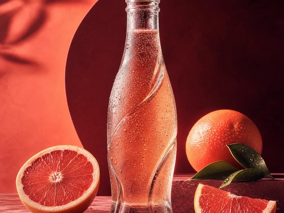
Use the attached product photograph as the reference for the bottle only. Create a landscape 3:2 campaign photograph with the bottle upright on a pale limestone block in the right half. Preserve the product's shape, cap, label placement, colors, and exact lettering. Warm ivory studio backdrop, soft daylight from the upper left, realistic contact shadow. Keep the left third empty for headline placement. No extra bottles, plants, hands, splashes, written copy outside the label, or changes to the package design.Accept when: the silhouette and label match the packshot, the bottle touches the block convincingly, and the open area accommodates the actual headline. If the text fails, do not approve an approximate package. Keep the real packshot for compositing or try a narrower edit. Our product photography guide covers the source-image workflow.
4. A localized version of an approved poster
Supply approved replacement copy instead of delegating both translation and design in one step. That gives the language reviewer and designer the same target.
Edit the attached book-fair poster. Replace "SMALL PRESS WEEKEND" with "FIN DE SEMANA EDITORIAL". Replace "Stories worth keeping" with "Historias para conservar". Replace "24 OCTOBER" with "24 DE OCTUBRE" and "10 AM TO 5 PM" with "DE 10 A 17 H". Preserve the cream and burgundy palette, book illustration, overall hierarchy, margins, and paper texture. Adjust line breaks and text size only as needed to fit the supplied Spanish wording cleanly. Do not translate, paraphrase, or add any other text.Accept when: the requested strings are reproduced exactly and the longer headline has not crowded out the supporting copy. Have a fluent reviewer approve real campaign wording. For languages with a different reading direction, include that layout requirement explicitly and review the entire composition.
5. A portrait with a believable working environment
Ask for visible photographic decisions: pose, framing, light, and skin texture. For a fictional person, define the look once and save the accepted image as a future reference.
Create a landscape 3:2 editorial portrait of an attractive adult woman architect in her early thirties. Short dark curls, brown eyes, cream cotton shirt with rolled sleeves. Seated at a wooden table with one unmarked folded building plan. Place her in the right half, body angled slightly toward the table, looking at the camera with a relaxed confident expression. Soft north-window daylight, natural skin texture, realistic fabric folds, quiet warm-gray studio wall. Head and shoulders fully inside the frame, generous headroom, uncluttered left third. No readable text, logos, beauty-filter smoothing, extra hands, or collage.Accept when: the eyes, hands, shirt folds, and table contact look coherent. Check the portrait at full size before using it as a reference. A visually attractive starting image with malformed details is a poor foundation for a repeat character.
6. A localized material edit
Describe the selected object separately from the material sample. Use the selection or annotation controls available in your chosen interface to reinforce the location.
In the supplied living-room image, change only the upholstery of the armchair beside the window. Use the attached fabric swatch for its muted indigo color and fine woven texture. Preserve the chair's outline, cushion seams, wooden legs, position, scale, and perspective. Keep the wall, curtains, rug, table, and daylight unchanged. The material reference controls upholstery only. Do not copy the shape of any object from the swatch photo. Remove any temporary guide marks from the finished image.Accept when: the changed region stops at the upholstery boundary, seams survive, and reflected color has not repainted the room. Inspect edges around chair legs and cushions. If you cannot precisely identify the intended object, add a clearer annotation before adding more descriptive adjectives.
Turn a good image into a reusable campaign
Save an approved source, its brief, and the exact copy before requesting variations. Then change one campaign variable at a time: background, season, language, or placement. This keeps the reason for each version clear.
For a small launch, plan a hero image, a product detail, a portrait, and one process graphic. Reuse a short palette and lighting description across the set. Check the pieces together: four individually pleasing assets can still feel unrelated if their contrast, typography, or subject scale differs.
You can apply that campaign brief in Dream Pixel Forge's ad workflow and organize product references with the deliverables. This is a workflow alternative, not a claim that the app exposes Seedream 5.0 Pro or its full editing controls.
What should you verify before using the output?
Check content accuracy before visual polish. A well-designed image with an invented number or changed product is still unsuitable for the brief.
| Asset | First check | Next check |
|---|---|---|
| Infographic | Every fact and label matches the supplied content | Reading order and legibility |
| Poster | Exact headline, date, and offer | Hierarchy and margins |
| Product image | Package identity and lettering | Contact shadows and material |
| Localized design | Approved wording and punctuation | Line breaks and reading direction |
| Portrait | Face, hands, and intended identity | Light and texture |
| Regional edit | Requested region changed correctly | Everything outside it stayed appropriate |
For charts, supply the underlying values and independently check the geometry against them. For essential fine print, consider typesetting it outside the generated image. For identity-sensitive portraits or exact product packaging, retain the source so reviewers can make a direct comparison.
How much does SeeDream cost?
This guide does not quote a universal Seedream price. Check the specific service and model version before generating: an offer labeled Seedream 4, 4.5, or 5.0 should not be assumed to describe 5.0 Pro. Start from the official model page when checking access.
For your own comparison, record the cost of all attempts required to get an accepted asset. A cheap first image is not necessarily a cheap finished poster if it takes repeated repairs to get the copy right. Use the same source, brief, and acceptance criteria when comparing tools.
To explore another model with illustrated original examples, read GPT Image 2.5 prompts and examples. For another reference-based prompt collection, see Nano Banana prompts.