Guides
Podcast Cover Art: Sizes, Requirements, and Ideas That Work
Get podcast cover art sizes and platform requirements, then learn the composition, contrast, typography, and genre cues that survive thumbnail display.
Podcast cover art is the single most-seen asset your show owns. It appears as a tiny square in every app directory, next to every episode, and on every share card, usually long before anyone hears a second of audio. That means it has two jobs at once: look good big enough to hang on a wall, and still read clearly at the size of a fingernail. Get the square right and it works everywhere. Get it wrong and Apple Podcasts rejects the upload outright.
This guide covers the parts that actually matter: the exact size and format requirements for the major platforms, what separates cover art that pops from cover art that disappears, concrete ideas by genre, and how to make your own square without hiring a designer.
What is the cover art of a podcast?
Podcast cover art is the square image that represents your entire show across every listening app: Apple Podcasts, Spotify, YouTube, Overcast, Pocket Casts, and the rest. It is set once at the show level and pulled from your RSS feed, so the same square follows your podcast everywhere it is distributed. Episode art is separate and optional; the show cover is the one image every platform requires before you can publish.
Because it is the first thing a browsing listener sees, the cover carries the show's genre, tone, and title in a single glance. Think of it as the book jacket for something with no pages: it has to signal what the show is and whether it is for you, instantly, at any size.
Podcast cover art size and requirements
Every platform enforces its own limits, but they overlap enough that one file satisfies all of them. Design a single square at the largest recommended size and export it correctly, and you never think about this again.
Apple Podcasts requires artwork between a minimum of 1400 x 1400 pixels and a maximum of 3000 x 3000 pixels, in a perfect square, saved as JPG or PNG. Apple explicitly says the largest size is preferred, and the cover cannot contain transparency or an alpha channel, so it needs a solid background before you export. Apple also publishes a Show Cover template with an art safe area, because the app overlays a play button, labels, and subscription prompts on top of your image; anything important pushed to the edges gets covered. See Apple's Show Cover requirements for the current spec.
Spotify is more permissive on size: it accepts square cover art anywhere from 640 to 10000 pixels wide and tall, at a 1:1 aspect ratio, as TIFF, PNG, or JPG with lossless encoding, and it wants the file encoded in the sRGB color space (RGB, never CMYK). Spotify also advises against upscaling a small image to hit the size, since that just softens it. Details are on Spotify's cover art requirements page.
YouTube is the exception worth knowing. Regular video thumbnails are 16:9, but when you set up a podcast playlist, YouTube asks for a square 1:1 thumbnail instead so the show sits alongside other podcasts correctly. Its thumbnail guidance spells this out.
The practical takeaway: build your cover at 3000 x 3000 pixels, square, RGB, JPG or PNG, with a solid background and no transparency. That single file clears Apple's ceiling, Spotify's range, and YouTube's square podcast slot at once. Keep every critical element, especially the title, inside the center so nothing is lost when an app crops or overlays controls.
What makes a good podcast cover art?
Good podcast cover art survives being shrunk. Most covers are designed at full size and judged at full size, then they turn to mush the moment they appear as a 60-pixel thumbnail in a directory, which is where nearly all of them are actually seen. The whole discipline is designing for the small view first.
- One focal idea, not five. A single strong motif reads at any size. A collage of the hosts, a microphone, three icons, and a tagline reads as noise once it shrinks. Pick the one image that signals the show and let it dominate the frame.
- A short, legible title. If the show name is on the cover, set it large in a heavy, simple typeface and give it real contrast against the background. Thin fonts and long titles vanish at thumbnail size. Many strong covers drop the tagline entirely and keep only the name.
- High contrast and a tight palette. Two or three colors with one accent that pops against a dark app background will out-perform a subtle gradient every time. Podcast apps default to dark mode, so test how your square looks on black, not just on white.
- Genre signal at a glance. A true-crime show and a kids' comedy should never be confusable. Color, texture, and imagery do this work: dark and grainy reads as serious, bright and rounded reads as playful.
- Nothing important at the edges. Apps overlay play buttons and labels on the corners, so keep the title and focal element centered inside the safe area.
The single best test is free: export your design, shrink it to about 60 pixels wide, and look at it next to real covers in a podcast app. If the title is unreadable or the image turns to a smudge, the design is not finished yet.
Podcast cover art ideas by genre
The fastest way to a cover that fits is to start from what the genre expects, then find the one twist that makes it yours. Here are directions that consistently work, organized the way listeners actually categorize shows.
True crime. Dark, moody, and a little unsettling. A stark silhouette, grainy film texture, deep shadows with a single harsh light source, and a restrained palette of black, white, and one blood-red or cold-blue accent. The genre rewards atmosphere over literal imagery; a lonely object lit dramatically beats a stock photo of a detective.
Comedy. Bright, loud, and friendly. Chunky rounded shapes, a saturated palette, exaggerated cartoon energy, and a title set big and bold. Comedy covers can afford to be busy where a drama cannot, because the tone signal is doing the selling.
Business and interviews. Clean and confident. A restrained two-color palette, crisp geometric layout, and plenty of negative space read as credible and professional. If the show is built on a host or recurring guests, a single sharp portrait treated with a consistent color wash works well as a series look.
Tech and science. Sleek and precise. Glowing accents, clean vector shapes on a dark gradient, and a modern typeface signal the subject without a single literal circuit board. Restraint reads as more advanced than density here.
Wellness and lifestyle. Soft and calm. Gentle gradients, organic hand-drawn accents, airy composition, and a warm muted palette. The cover should feel like a deep breath, which means resisting the urge to fill the frame.
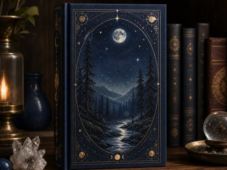
Fiction and storytelling. Cinematic and painterly. Treat it like a book or film poster: one evocative scene, dramatic lighting, rich atmospheric depth, and room at the top for the title. This is the genre where a single illustrated image carries the most weight.
How to make cover art for a podcast
You have three real routes: hire a designer, wrestle a template in Canva or Adobe Express into shape, or generate the artwork from a description and add your title on top. For most shows the third route is fastest, because the hard part of a cover is the illustration, and the easy part is the text.
The workflow that avoids the common mistakes: generate the artwork without any lettering, then add the show title yourself in a layout tool. AI-rendered text is still unreliable, and keeping the title as a separate editable layer means you can fix spelling, adjust the type hierarchy, and re-export at 3000 x 3000 without regenerating the image. It also lets you test the title at thumbnail size and swap it in seconds.
Our podcast cover art generator is built exactly around this. You describe what the show is about, pick a genre and a mood, and it produces square cover artwork tuned to the conventions above, with a strong central motif, high contrast for dark-mode apps, and clear space near the top for your title. There is no prompt to write and no template to fight. Generate a batch, shrink the ones you like to thumbnail size to judge them honestly, then drop your show name on the winner. Free trial credits mean you can try it on your actual show idea before paying for anything.
Try it now
Free to try, no account needed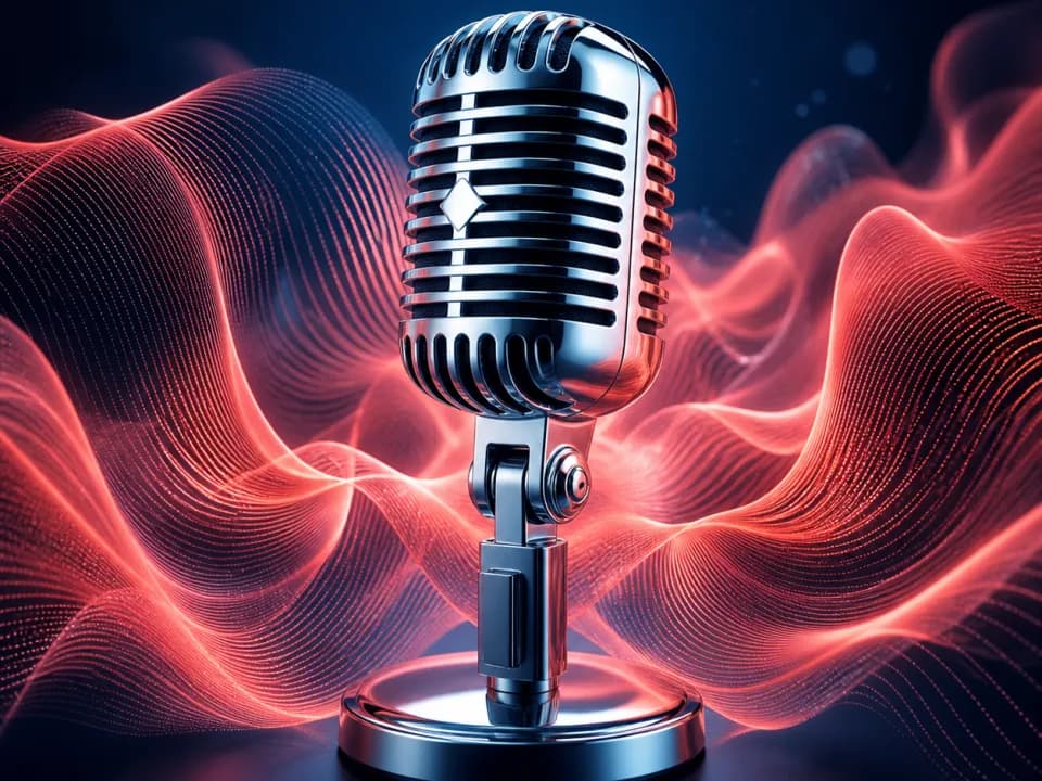 Example output
Your generated image will replace this example.
Whichever route you choose, the finishing steps are the same: confirm the file is a solid-background square at 3000 x 3000, RGB, saved as JPG or PNG under your host's file-size limit, with the title readable when the whole thing is 60 pixels wide. If it passes that test, it will look right in every app your listeners use.
Cover art is one piece of the brand
The same principles that make a cover work make the rest of a show's identity work, because they are the same principles good branding always follows: one clear idea, legible at any size, consistent across everywhere it appears. If you are building the whole visual identity, the thinking in our guides on how to design a logo and on writing a focused cover-art brief transfers directly. A podcast cover is, after all, a book jacket and a logo doing the same job in one square.