Guides
Ecommerce Product Photography: Shot List and Specs
Ecommerce product photography as a shot list: the six images a product page needs, the specs Amazon and Shopify publish, and which shots still need a camera.
Ecommerce product photography is a gallery problem before it is a camera problem. Most stores lose sales less because the main image is mediocre and more because the images answering the buyer's next three questions, how big is it, what is it made of, what does it look like in a real room, were never taken. Baymard's product page testing found that 56 percent of test subjects began by exploring the product images before reading the title or description, and 42 percent tried to work out the product's physical size from those images.
So the useful question is not "how do I get a better hero shot." It is "which shots am I missing, and what does each destination require of them." Below: the shot list, the specs Amazon and Shopify actually publish, how to decide which shots need a camera, and how to fill the rest from one good photograph. Every spec was checked against the platform's own documentation in July 2026. Cost figures live in the companion guide to product photography pricing, so this page stays on craft and requirements.
What actually converts on a product page
Two findings from the same Baymard study are worth building a shot list around. Images are the first thing shoppers touch, and scale is the thing images most often fail to communicate: 28 percent of sites provide no in-scale image at all, and in testing that gap led users to draw wrong conclusions about size, discard products that would have fit, and in some cases abandon the site.
Amazon publishes a similar position from the seller side. Its own guidance says every product needs at least one image and recommends at least six, covering individual views, group shots, lifestyle images showing the product in use, scale comparisons against familiar objects, feature close-ups, and packaging.
What you will not find is a trustworthy number for how much better photos lift conversion. The 33 percent, 30 percent, and 94 percent figures repeated across this topic trace back to blogs citing blogs with no locatable study, which the guide to AI product photography takes apart in detail. Treat the gallery as an inventory of buyer doubts instead: every unanswered question is a reason to close the tab, and you can measure the effect on your own listings in thirty days.
The ecommerce photography shot list every store needs
Six shots cover the questions. Fewer than six and you are relying on the description to do work that images do faster.
| Shot | The question it answers | Where it goes |
|---|---|---|
| White background packshot | What exactly am I buying? | Marketplace main image, category thumbnails, feeds |
| In-scale shot | How big is it really? | Second gallery slot |
| Detail or macro | What is it made of, how well is it made? | Third slot, plus zoom |
| Lifestyle scene | Does this fit my kitchen, desk, bathroom, life? | Middle slots, ads, email, social |
| In use or on a model | How does it work, how does it wear? | Apparel, accessories, cosmetics, anything with a mechanism |
| Packaging or what is in the box | What actually arrives? | Final slot; cuts support tickets and returns |
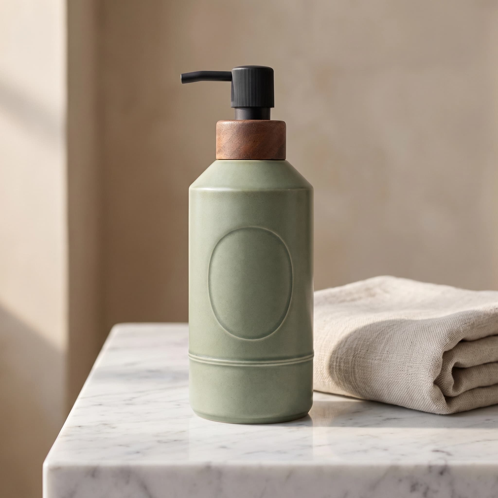
White background product photography: hitting RGB 255, 255, 255
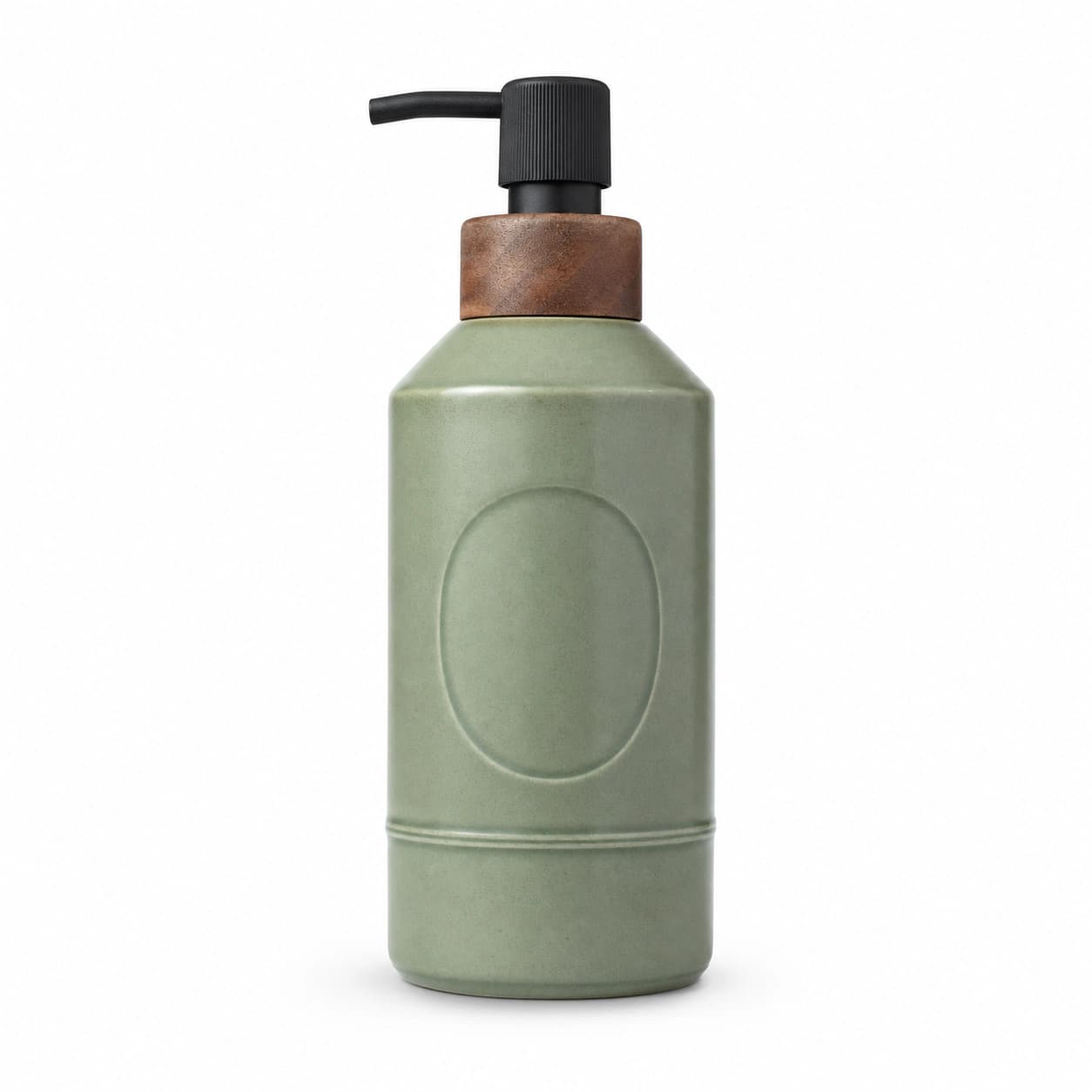
White background product photography is a lighting problem, not a Photoshop problem, and the difference shows at the edges. Light the backdrop separately from the product: a white sweep or seamless paper behind the item, and enough light on that backdrop that it reads clearly brighter than the product, which studio practice usually puts at one to two stops up. That separation is what makes the background clip to true white without a halo bleeding around the silhouette. Then check it rather than trusting your eyes: sample the background with an eyedropper and confirm 255, 255, 255, which is the value Amazon specifies for main images.
Two failures are worth naming. Underlit backdrops go gray and uneven, and no levels adjustment fixes gray unevenly. Overexposure is the opposite trap, and it is worst on white, cream, and glass products: retoucher Pixelz describes the main mistake in this scenario as overexposing both foreground and background, which leaves nothing to mark where the product ends and the backdrop begins. If you shoot with a phone next to a window and a foam board bounce, expect the gray version, and plan to clean up in post.
The reliable cleanup is a mask rather than a brush. Removing the background gives you a transparent PNG whose product pixels are untouched, which you then place on true white with a real contact shadow underneath. Without that shadow the product floats and the image reads as fake even to shoppers who cannot say why. Our product background changer does the swap with a rendered contact shadow, and how to remove a background from an image covers the edge-quality checks that decide whether a cutout survives zoom.
In-scale shots, the slot most stores skip
An in-scale shot puts the product next to something whose size nobody has to guess: a hand, a coffee cup, a doorway, a phone. It is the cheapest shot on the list and the one with the clearest evidence behind it, since 42 percent of shoppers are trying to answer the size question from images regardless of whether you helped them. Dimension callouts drawn onto the image work too: Baymard recommends adding descriptive text or graphics to some product images and found 52 percent of sites do not do it for their top-selling products. Keep those annotated versions out of marketplace main-image slots, where text is prohibited.
Lifestyle product photography: what it has to prove
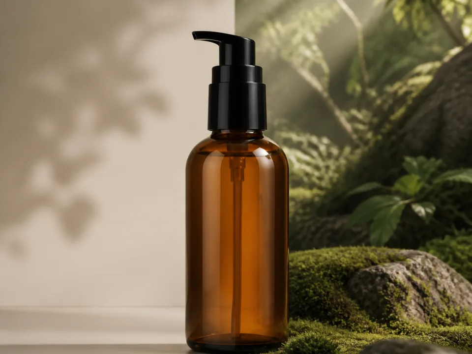
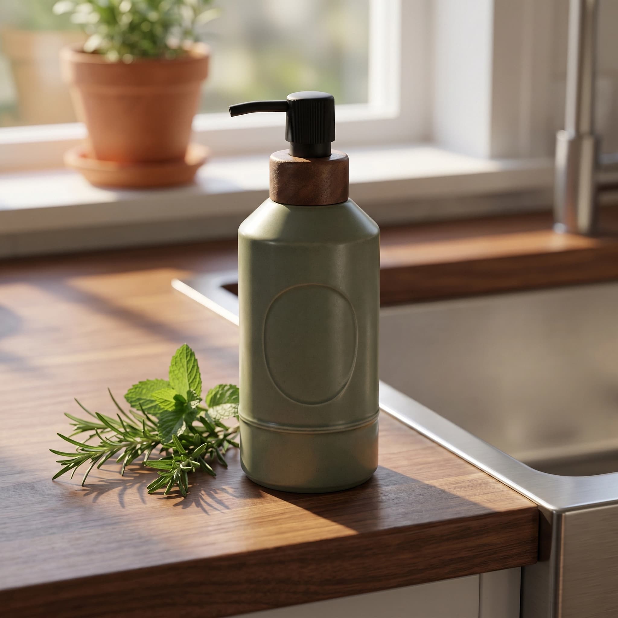
Lifestyle product photography shows the product in the setting where it gets used, styled with props and context rather than isolated on white. Its job is not beauty. Its job is letting a shopper picture the item in their own space, which means the setting has to match reality: a kitchen counter for drinkware, a vanity for skincare, a desk for tech, a hallway for a doormat. A moody editorial set for dish soap reads as staged and quietly costs trust.
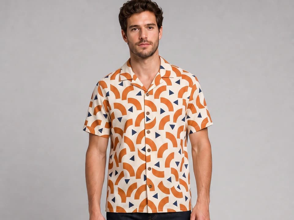
One category rule matters more than styling taste. For apparel, accessories, and cosmetics, Baymard found that cutout-only images leave shoppers with lower confidence and lower likelihood to purchase, because fit, length, proportion, and how a shade actually looks on skin cannot be read off a flat product shot. For cosmetics specifically, the research calls for each shade shown on multiple models of diverse skin tones, since shoppers rejected products when they could not find a model close to their own complexion.
Customer-style images, the slightly imperfect phone-quality shots that look like a real buyer took them, do a different job again. They belong in social proof sections and in paid social, not in slot one, and they are the format covered in the guide to UGC ads.
Amazon product photography requirements
Amazon product photography is the strictest destination most sellers deal with, and the constraints are all on the main image. From Amazon's published guidance:
- Main image on a pure white background, RGB 255, 255, 255, with the product filling 85 percent or more of the frame.
- Images 500 to 10,000 pixels on the longest side. Larger than 1,000 pixels on each side is preferred, because that is what activates zoom on the detail page.
- JPEG, TIFF, PNG, or non-animated GIF, with JPEG the preferred format.
- At least one image is required per product, and Amazon recommends at least six.
The main image also has to be the product alone. Amazon's Seller Central image requirements disallow text, logos, watermarks, and inset images there, along with props and accessories that are not included in the purchase. Everything interesting therefore happens in the secondary slots, which is where the lifestyle, scale, detail, and packaging shots from the list above go. Amazon's full technical and content rules, plus the newer disclosure obligation for images containing photorealistic AI-generated people, are covered in the AI product photography guide; Etsy's rules are stricter still and are covered there too.
Shopify image specs
Shopify constrains files rather than content, since you own the storefront. Per Shopify's product media documentation, product and collection images can be any size up to 5000 by 5000 pixels, or 25 megapixels, must be under 20 MB, and display best at 2048 by 2048 pixels for square images. PNG and JPEG are the best options, with PSD, TIFF, BMP, GIF, SVG, HEIC, and WebP also accepted, including animated GIF and WebP. Shopify also recommends keeping a uniform aspect ratio across featured images so collection grids do not jump.
The practical consequence is that one export standard covers both destinations. A 2048 by 2048 JPEG sits above Amazon's zoom threshold, inside Shopify's recommended size, and crops cleanly to 4:5 and 16:9 for social and banners. Save your masters larger, ship 2048 squares.
DIY, studio, or AI: which route for which shot
This is rarely an all-or-nothing decision, and treating it as one is what makes product photography feel unaffordable. Each route is good at different rows of the shot list.
| Route | Best at | Where it breaks |
|---|---|---|
| DIY, phone plus window plus sweep | Packshots, in-scale, packaging, straightforward matte products | Glass, chrome, jewellery; consistency across a large catalog; styled sets |
| Studio or freelance photographer | Reflective and transparent goods, on-model apparel, macro texture, campaign heroes | Turnaround, per-SKU cost, and a reshoot every time you add a colorway |
| AI from a reference photo | Lifestyle scenes, seasonal variants, ad and email crops, backdrop swaps | Fine print on packaging, exact color, fine texture, mirror reflections |
Most small catalogs land on the same mix: one real session that covers the packshot, the macro, and the in-scale shot for each SKU, then generate the lifestyle set and the ad crops from those photographs. That is cheaper than a full styled shoot and more defensible than a gallery with no real photographs in it. For what each route costs per image, see product photography pricing.
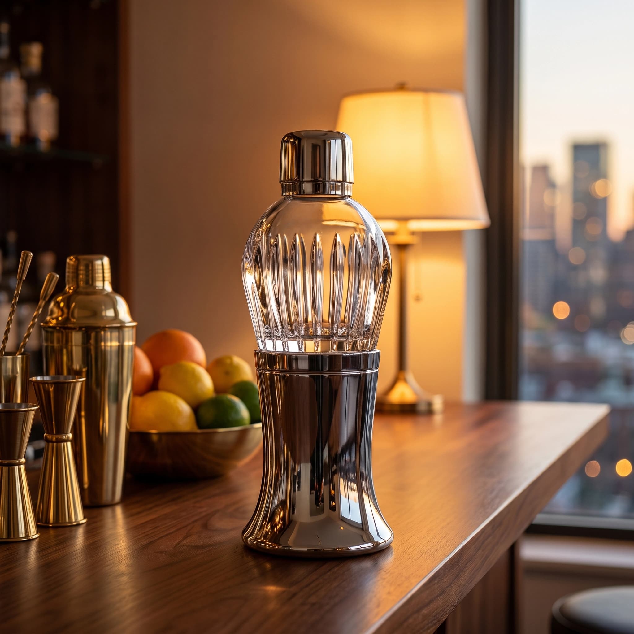
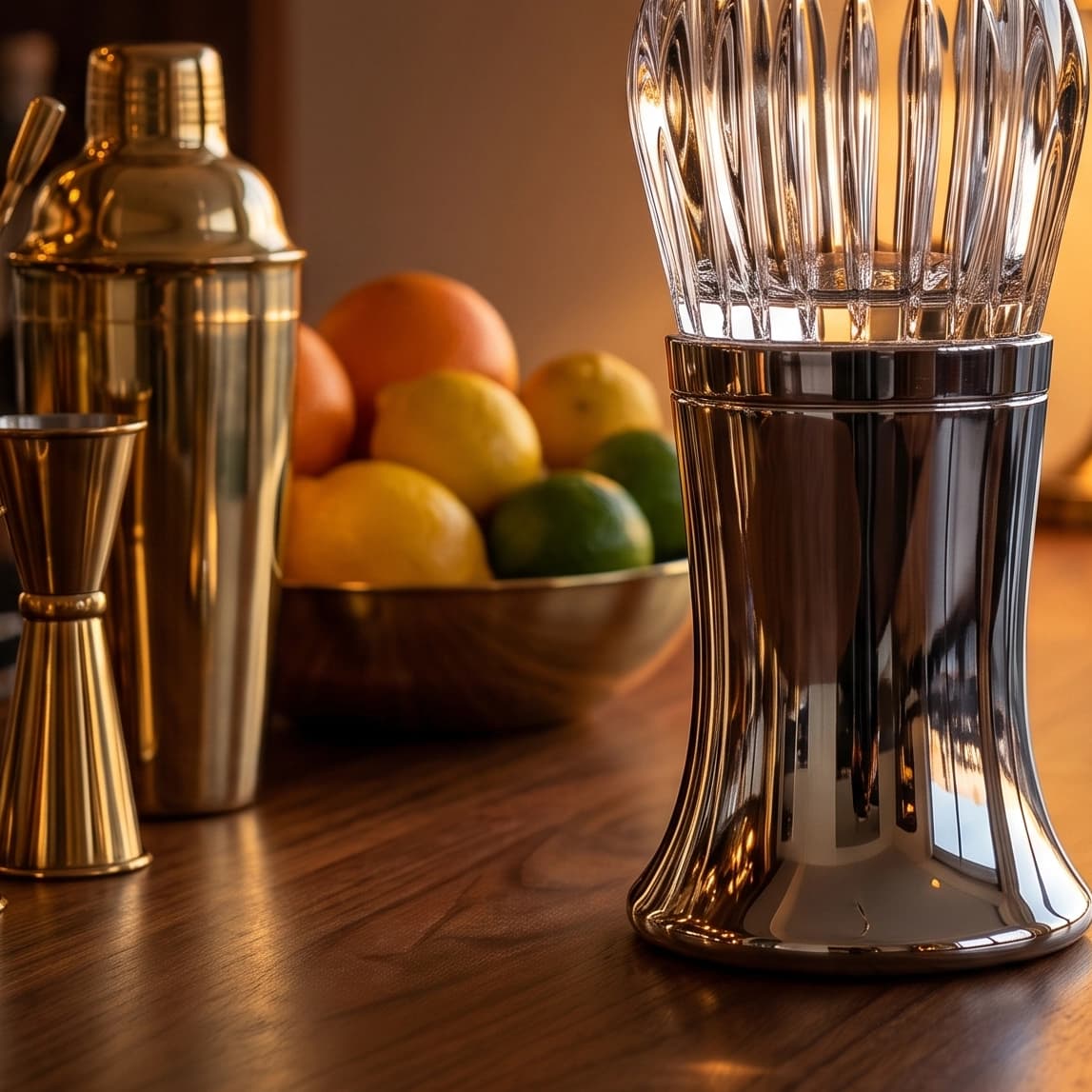
Where AI product images fit in the gallery
The workable pattern is photograph once, generate the rest. AI product images are built by feeding a real photo of your SKU into a model and asking for a new scene around it, which is a different operation from asking a text prompt to invent a product that resembles yours. The first belongs in your gallery; the second does not.
- Shoot the packshot properly. Sharp, evenly lit, product filling the frame, plain background, straight on or a slight angle. Everything downstream inherits this photo's quality.
- Clean it to true white. Mask, composite on 255, 255, 255, add a contact shadow, check for a gray fringe. Slot one is done and it is a real photograph.
- Generate the lifestyle set from that one file. Same reference, varied scene and lighting, three to five frames. The product lifestyle scene generator takes your photo plus a scene and lighting preset; the background changer is the narrower version when you only want a new surface.
- Fill the marketplace slots deliberately. The Amazon listing image generator works slot by slot: white-background main image, lifestyle, feature close-up, scale or in-hand, flat lay with props, at the square ratio Amazon expects.
- Crop per destination. 1:1 for the gallery, 4:5 for feed placements, 16:9 for banners and email heroes.
- Audit at 100 percent. Read every word of label text against the original, compare color against the physical product, and check that the product is not floating. A shift in color is a fail, not a style choice, because the buyer opens the box.
- Keep the information-carrying shots real. Macro texture, packaging copy, certification marks, and anything a regulator cares about stay photographs.
The slot-by-slot version is the fastest place to start if you sell on a marketplace, because it encodes the destination's rules rather than leaving you to remember them:
Try it now
Free to try, no account needed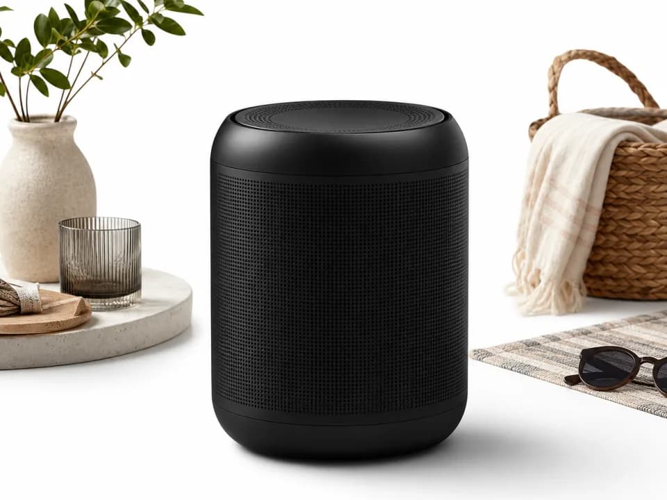 Example output
Your generated image will replace this example.
For a deeper look at which technique preserves your product and which redraws it, plus the failure modes on reflective goods and small type, read the AI product photography guide. If your product is a design rather than an object, print-on-demand and Etsy sellers with no physical sample yet should start with free product mockups instead.
Reuse the gallery as ad creative
The shot list pays for itself twice. A lifestyle frame at 4:5 is a paid social ad with no extra production, a packshot on a flat color field is the classic offer static, and a detail macro carries a claim about materials better than a headline does. The mechanics of turning a gallery into a campaign set are in static ads and AI-generated ads, including the specs each placement enforces.
Where to start
Take your ten highest-revenue listings and audit them against the six rows. Most stores find the packshot is fine and the in-scale, detail, and packaging shots are missing entirely, which is a one-afternoon fix with a phone and a window. Then generate the lifestyle set from the packshots you already have, ship the new galleries on half your listings, leave the other half alone, and read your own conversion data in thirty days. That number will be worth more than any benchmark on this topic, including the ones on this page.