Guides
Static Ads: What They Are and How to Make Them
Static ads are single still images: what they are, how they differ from dynamic and video ads, static ad examples by placement, and the published specs.
Static ads are single still images: one frame, no motion, no per-viewer assembly. They remain the default format across paid social and display, because a still image is cheap to make, quick to iterate, and readable in the half second before a thumb moves on.
The interesting question is not whether static beats video. It is which job each format is doing. This guide covers what a static ad is, how it differs from dynamic and video ads, examples by placement, the exact specs each platform publishes, and how to produce a full on-brand set without spending a week in a design tool.
What is a static ad?
A static ad is an advertisement built from one fixed image asset: a photograph or graphic, usually with a headline, a logo, and sometimes a price or offer burned into the artwork or supplied as separate ad copy. Nothing animates. Every person who sees the placement sees the same pixels.
That definition rules out three things people often lump in:
- Video and animation. A six second looping GIF is not static. Google's uploaded display ads accept animated GIF alongside JPG and PNG, which is why "image ad" and "static ad" are not quite synonyms in Google Ads.
- Dynamic ads. These are assembled at delivery time from a product catalog, so the creative differs per viewer.
- Interactive units. Playables, carousels with swipe mechanics, and collection ads add behavior on top of the image.
Everything else is static: the product shot on a colored background, the before and after split, the customer quote card, the offer banner, the founder photo with a claim across it.
Static vs dynamic ads: what actually differs
The difference is where the creative is assembled. A static ad is finished before it is uploaded. A dynamic ad is a template plus a feed, and the ad network fills the template per impression.
Meta's version is Advantage+ catalog ads, which the platform previously called dynamic ads: you connect a product catalog, and the system chooses which products to show each person based on their behavior. Google's responsive display ads work on a similar principle for creative rather than catalog: you upload images, headlines, and descriptions as separate assets, and Google combines and resizes them to fit whatever placement it wins.
Practical consequences:
- Static gives you control, dynamic gives you coverage. With static you know exactly what ran. With dynamic you get products or combinations you never explicitly approved.
- Static is the only way to make a specific argument. A catalog feed cannot say "three of these cost less than one of theirs." A designed image can.
- Dynamic needs inventory, static needs ideas. Dynamic is worth the plumbing when you have hundreds of SKUs. With five products, a set of designed statics beats a feed.
- They are not exclusive. Most accounts run dynamic for retargeting and catalog coverage, and static for prospecting, offers, and anything with a message.
Is a static ad better than a video ad?
Neither is better in general, and the percentage comparisons that circulate are account specific rather than universal. What holds up across accounts is a set of structural differences:
- Production cost and cycle time. A static set can be produced and shipped in an afternoon. A video needs a script, a shoot or an edit, and revisions. That difference decides how many ideas you can test per month, which is usually the real constraint on ad performance.
- Comprehension speed. A static ad delivers its whole message in the first frame. A video's message is spread over time, so it depends on retention that most viewers never give it.
- Placement fit. Feed and display placements render statics natively. Stories and Reels are built for full screen motion, and a still image there is competing with video on video's home turf.
- Explanation depth. Anything that needs demonstration, a physical process, a UI walkthrough, an unboxing, is a video job. A still can show the result but not the sequence.
The workable default: static for offers, comparisons, social proof, and feed prospecting, video for demonstration and full screen placements. Test both against the same audience rather than trusting a benchmark from someone else's account. If you are building the video side too, our guides on UGC ads and AI generated ads cover that half.
Static ad examples by placement
The recurring static ad formats, and where each one earns its keep:
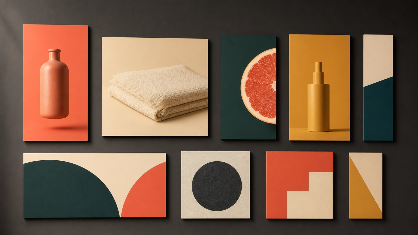
- Product on color. The product cut out and placed on a flat brand background, sometimes with a one line benefit. The workhorse of ecommerce feed prospecting because it survives every crop and reads at thumbnail size.
- Lifestyle scene. The product in a plausible real setting: on a kitchen counter, in a bag, on a desk. Slower to read than product on color, better at communicating who it is for.
- Offer or promo banner. Big number, short deadline, clear button language. Standard for display retargeting and seasonal pushes.
- Comparison and before/after. Two panels, one visual claim. Strong for anything with a visible result, weak where the difference is not photographable.
- Testimonial or review card. A five star screenshot or a pull quote set as type over a simple background. Works because it borrows credibility instead of asserting it.
- Feature callout. The product with two or three labeled arrows pointing at specifics. Dense, and best for considered purchases where people actually read.
- Native looking still. A photo styled to look like an organic post rather than an ad, which is the static cousin of UGC video.
Match the example to the placement rather than reusing one asset everywhere. Feed placements can carry text and detail. Stories and Reels need one idea at poster scale. Display banners at 300 x 250 have room for a logo, five words, and a button, and nothing else.
Static image ads: specs by placement
Every platform publishes its own numbers, and getting these wrong is the most common reason a good creative renders badly. The figures below come from Meta's ads guide, Google's display ad specifications, and Pinterest's product specs:
| Placement | Ratio | Resolution | File |
|---|---|---|---|
| Facebook Feed image | 4:5 | 1440 x 1800 | JPG or PNG, up to 30MB |
| Instagram Feed image | 4:5 | 1440 x 1800 | JPG or PNG, up to 30MB |
| Instagram Stories image | 9:16 | 1440 x 2560 | JPG or PNG, up to 30MB |
| Google responsive display, landscape | 1.91:1 | 1200 x 628 (min 600 x 314) | Up to 5120KB |
| Google responsive display, square | 1:1 | 1200 x 1200 (min 300 x 300) | Up to 5120KB |
| Google uploaded display | Fixed sizes | 300 x 250, 336 x 280, 728 x 90, 300 x 600, 320 x 50, 320 x 100 and more | GIF, JPG or PNG, up to 150KB |
| Pinterest standard Pin | 2:3 | 1000 x 1500 | PNG or JPEG, up to 20MB on desktop |
Three details worth knowing beyond the table. Google's uploaded display ads cap at 150KB, which is two hundred times tighter than Meta's 30MB allowance, so display banners need real compression discipline while social does not. Meta's Facebook Feed guidance suggests primary text of 50 to 150 characters and a 27 character headline, while Instagram Feed lists 125 characters of primary text and a 40 character headline, so the same creative usually needs two copy variants. And Stories creative gets covered at the edges: Meta's guide asks you to keep roughly the top 14 percent, the bottom 35 percent, and 6 percent on each side clear of anything that must be read.
One myth to retire: Facebook's 20 percent text rule is gone. Meta removed the penalty in 2020, stating it would no longer penalize ads with higher amounts of text in auctions and delivery, though it still advises keeping text light. Full per placement dimensions live in our Facebook ad size and banner ad sizes guides.
What makes a good static ad
Four things separate statics that work from statics that fill an ad account:
- One idea. A still image gets one message. If your creative brief has three benefits, that is three ads, not one crowded frame.
- Thumbnail legibility. Shrink the finished ad to the size of a stamp. If the product silhouette and the headline are still identifiable, it works in a feed. If it turns to mush, the composition is too busy or the contrast is too low.
- Text placed deliberately. Leave clear space in the artwork for the headline and logo instead of dropping type over a detailed area. Generate the imagery with a text free zone reserved, then set the type in a layout tool where you control the font.
- Enough variants to learn something. One static tells you nothing. A set that varies one dimension at a time, background color, hook, format, product angle, tells you which lever moves the result.
That last point is why static beats video for most testing programs: producing eight honest variants is a realistic afternoon in a way that eight video edits never are.
How to produce an on-brand static ad set fast
The bottleneck in static advertising has never been the idea. It is the production time between the idea and eight finished, correctly sized, on-brand files. That is the gap an AI ad generator closes.
A working process:
- Fix the brand basics first. Palette, product photography style, and the tone of the copy. Everything downstream inherits these, so getting them wrong multiplies.
- Generate backgrounds and scenes, not finished ads. Produce the imagery with clear space reserved for type. AI rendered lettering is still unreliable, so keep the words out of the pixels and add them in a layout step.
- Use your real product where the product is the point. Background replacement puts your actual product into a generated scene rather than a plausible imitation of it. For a fuller treatment of the photography side, see AI product photography.
- Batch the variants. Ad creative variations produces a set from one brief, which is what you need for a test rather than one hero image.
- Export per placement. Build the 4:5 feed version and the 9:16 story version as separate crops with their own safe areas, not one file stretched twice.
For the banner side specifically, the AI ad banner generator produces wide format ad artwork from a description, with free trial credits and no account required to start.
Try it now
Free to try, no account needed Example output
Your generated image will replace this example.
The bottom line
Static ads survive because they are the cheapest way to put a specific idea in front of a specific audience and find out whether it lands. Use them for offers, comparisons, proof, and feed prospecting. Use video where a sequence has to be shown. Build the imagery with space for type, export per placement at the published specs, and ship enough variants that the results mean something.